Color schemes are essential in design as they influence mood, ensure brand consistency, and improve accessibility by creating effective visual communication through the use of harmonious and contrasting colors.
Color schemes may seem like a simple choice, but the right palette can transform any project. Have you ever wondered why some designs captivate your attention while others fall flat? Let’s explore how to make those impactful choices.
Understanding the basics of color theory

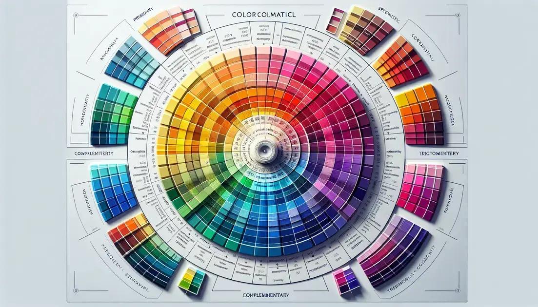
Understanding color theory is essential for anyone involved in design. It helps to communicate ideas effectively and evoke emotions. Color theory revolves around the color wheel, which showcases primary, secondary, and tertiary colors.
Primary Colors
The primary colors are red, blue, and yellow. These colors cannot be made by mixing other colors together. They serve as the foundation for creating all other colors.
Secondary Colors
When you mix primary colors, you create secondary colors: green (blue + yellow), orange (red + yellow), and purple (red + blue). These colors add depth and complexity to your palette.
Tertiary Colors
Tertiary colors are achieved by mixing a primary color with a secondary color. Examples include red-orange and yellow-green. This combination allows for a broader range of hues in your designs.
Complementary Colors
Complementary colors are opposite each other on the color wheel, such as blue and orange. Using these colors together can create a striking visual contrast that grabs attention.
Analogous Colors
Analogous colors are next to each other on the color wheel, like blue, blue-green, and green. They create a harmonious look and are often pleasing to the eye, making them great for backgrounds and designs seeking calmness.
Color Psychology
Colors can convey different feelings and meanings. For instance, blue often represents trust, while red can signify passion or urgency. Understanding color psychology allows designers to influence emotions effectively.
How to effectively use color schemes in design

Using color schemes effectively in design can elevate the overall aesthetic and functionality of your project. Different color combinations can influence how people perceive your work and can create mood and coherence.
Establishing a Color Palette
First, define your primary color. This will serve as the main color for your design. From there, you can choose secondary and accent colors that complement your primary color. Use tools like color wheels to identify harmonious color combinations.
Consistency is Key
Maintaining a consistent color scheme across all platforms is crucial. Whether it’s a website or social media post, consistent colors create a unified brand image. This consistency helps in building brand recognition.
Testing Your Color Choices
It’s important to test your color choices in different contexts. What looks good on a screen may not translate well to print. Also, check how the colors appear under different lighting conditions. Tools like mockups can help visualize your design.
Accessibility Considerations
Make sure your color schemes are accessible to all users. Consider color blindness and choose contrasting colors to ensure readability. Using tools to check color contrast ratios can be very helpful in this regard.
Trends and Timelessness
Stay informed about color trends, but also aim for timelessness in your designs. Trends can change rapidly, so balancing trendy colors with classic designs is advisable. This approach ensures longevity and reduces the need for frequent redesigns.
In summary, understanding color schemes is essential for effective design
Choosing the right colors can enhance communication and emotional response. By establishing a clear color palette, maintaining consistency, and prioritizing accessibility, designers can create impactful visuals.
Testing color choices in various contexts ensures they resonate with the audience. Balancing current trends with timeless design can lead to more sustainable projects.
Embrace the power of color to make your designs truly engaging and memorable.
FAQ – Frequently Asked Questions about Color Schemes in Design
Why is understanding color theory important in design?
Understanding color theory helps create effective designs that communicate ideas and evoke emotions.
How do I choose a primary color for my design?
Choose a primary color that reflects your brand values or the message you want to convey, as it will set the overall tone.
What is the difference between complementary and analogous colors?
Complementary colors are opposite each other on the color wheel and create contrast, while analogous colors sit next to each other and create harmony.
How can I ensure my color scheme is accessible?
Use contrasting colors to ensure readability and check your color combinations against accessibility tools to accommodate color blindness.
What tools can I use to test color combinations?
Tools like Adobe Color, Coolors, and various color contrast checkers can help you visualize and test your color choices.
Should I follow color trends in my designs?
While it’s good to be aware of trends, aim for a balance between trendy and timeless colors to ensure your designs remain relevant.
